MSP PX Cloud onboarding UX

Crafting an onboarding journey that helps users master the tool as they set it up


Cisco MSE PX Cloud is a new portal for managed services providers to deliver network as a service to their customers. My job was to define a onboarding process where the user would start adding the data required to use the platform in a simple way.

ROLE

Concept, UX, UI Design

DATE

2023

Overview

MSP PX Cloud is a Network-as-a-Service (NaaS) orchestration platform designed to help Managed Service Providers (MSPs) efficiently manage and scale network services through the cloud. By integrating with existing Cisco tools, it allows MSPs to automate network configuration, streamline adjustments, and monitor their customers' networks from a single interface. This reduces manual workloads, minimizes errors, and cuts operational costs, making network management more agile and scalable.


For network engineers, managing customer networks today is often complex and time-consuming. They deal with manual configurations across multiple platforms, inconsistent network policies, and slow provisioning times—all of which increase operational overhead and the risk of misconfigurations. MSP PX Cloud simplifies this process by providing a centralized, automated solution, enabling engineers to deploy, adjust, and troubleshoot networks seamlessly without the inefficiencies of traditional methods.


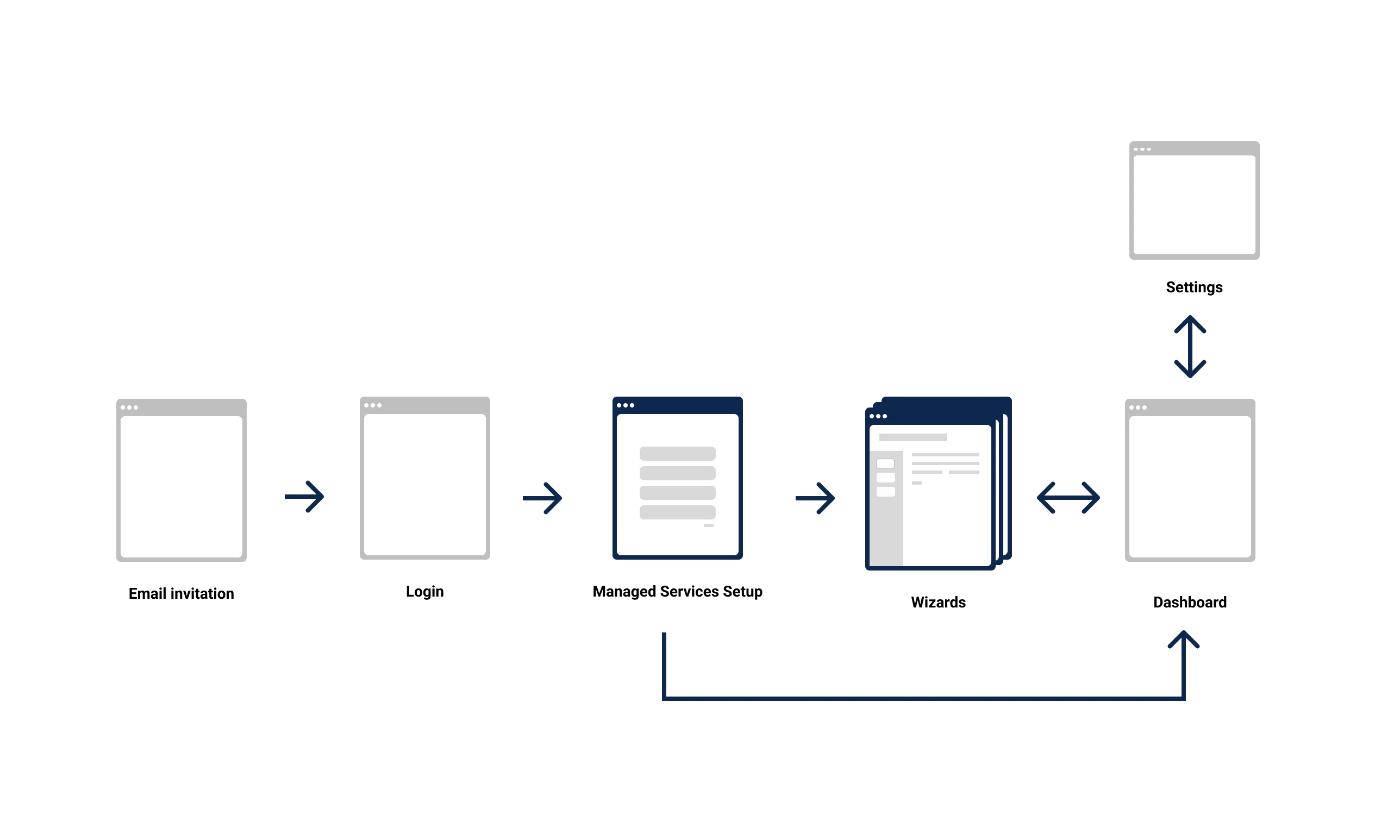
I was brought into this project to design the onboarding experience for this powerful but complex platform. When I joined, the project was already underway, but onboarding had been overlooked—a critical gap, given the technical nature of the tool. The requirements were still evolving, and my role was to ensure that new users could quickly understand and navigate the system, reducing friction and accelerating adoption.

Problem statement

While MSP PX Cloud offers powerful orchestration capabilities, new users struggled with the lack of a clear onboarding experience. Onboarding had not been prioritized, and requirements were scattered across multiple subject matter experts (SMEs)—each with conflicting priorities. Without a structured introduction, users faced a steep learning curve, leading to delayed adoption and increased support needs.


At the same time, MSP PX Cloud is part of a broader ecosystem, including PX Cloud and CX Cloud, with existing navigation patterns and UI frameworks. Inconsistencies in visual design and user experience across these platforms could cause confusion and disrupt workflow continuity.


How might we create an onboarding experience that balances the diverse needs of stakeholders while ensuring new users can quickly understand and navigate the platform—while maintaining consistency with the broader PX and CX Cloud ecosystem?

Process

My task was to design an intuitive onboarding flow tailored to network operators.


Through years of participating in usability research and working closely with research teams, I’ve observed that more experienced professionals often prefer working independently, as they may find too much guidance unnecessary or even frustrating. On the other hand, younger users tend to appreciate more help and direction.


The first challenge was identifying the key technical specifications needed to set up the tool.


Working alongside two PMs, an EPM, an Engineering Lead, my priority was understanding what was essential for the setup process. My role was to advocate for the users, focusing on distilling the critical onboarding steps while avoiding unnecessary complexity.


Wireframing & Iteration


To begin, I reverse-engineered the Day N (post-onboarding) prototypes to understand what Day 0 should look like. I created sketches and wireframes to facilitate discussions among stakeholders, using the wireframes as a visual tool to clarify and negotiate technical requirements.

We entered an intense cycle of wireframing concepts, validating with the team, adjusting based on feedback from SMEs and iterating prototypes.

This iterative approach allowed us to rapidly flesh out specs, refine the onboarding flow, ensuring it met both user needs and technical requirements. I find that, in situations like these, wireframes are incredibly helpful for facilitating conversations between stakeholders. 


In parallel, I collaborated with the broader design team to ensure alignment with Cisco’s existing design patterns and platform consistency.


Below you will see the main onboarding flow; however I also designed all the workflows for adding new items as part of the process described here.

Solution

Cisco operates with a traditional sales model, where customers buy first and then use the product. In this case, adoption becomes critical when it’s time for contract renewals. Onboarding is the first step in tool adoption; it sets the tone for the overall experience and creates the first impression.


From the outset, it was clear to me that approaching this purely from a training or tour perspective didn’t make sense. People often learn by using the tool, and this particular user base is highly technical, so they may not need much hand-holding. My hypothesis was that the best approach would be to offer a bit of guidance to start, but also allow users to skip it entirely without any negative impact.

How does it work?


After purchase, user administrators receive an email inviting them to the portal. From this email, they login with their Cisco credentials and are redirected to the onboarding landing page.

There are four optional tasks for the admin user to complete in order to use the portal to its fullest potential. Each card links to a workflow for completing a task (which I also created as part of this job). Users can follow any order they prefer, though the tasks are organized in the way users are most likely to follow naturally, according to our SMEs.


Users can skip the guidance entirely and land on the dashboard, where they will find call-to-action buttons that allow them to perform the same tasks. Alternatively, all tasks can also be completed from call to actions at the dashboard and from settings.

A first version of the flow

A basic view of what it evolved to

My final mid-fidelity wireframe for the onboarding landing page.

Once a workflow is completed, a toast notification shows what has been added. The corresponding card then indicates that the task is completed. In the lower area, users can see one item, with the badge displaying the number of additional items if more are included.

When tasks are not fully completed, users can reopen the wizards through the card button, which is re-labeled as "Edit."

I designed every workflow on this setup and I am happy to show you if you are interested.

Feedback from the team

Once implemented, a way to measure success is to track if this feature improves retention rates by helping users act on insights faster and more effectively.

Surfacing useful insights whilst making them easy to understand and follow up can reduce churn, improve retention and potentially help with customer acquisition. Concept and planning were extremely well received when presented, highly praised by the creative approach and alignment with business strategy. This aligns with Cisco’s broader vision of leveraging AI to create a more immersive, engaging user experience. 


The concept was well received by peers and management, who praised its alignment with business goals and its innovative approach. We are now moving forward with plans to explore AI video avatars and prepare for further user testing.